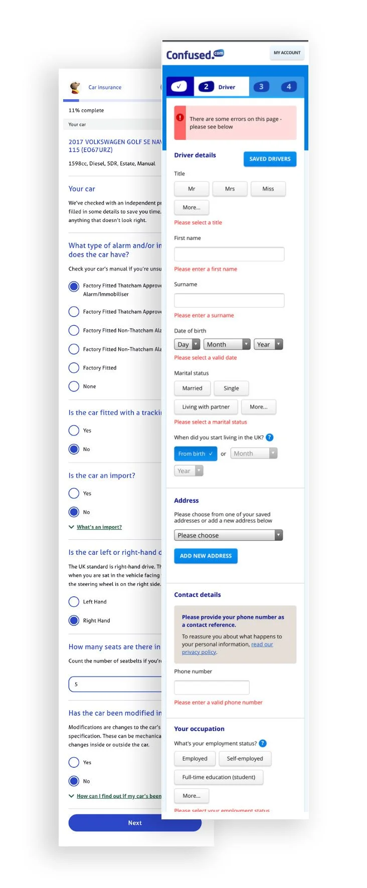
Clearscore - Car insurance
Project overview
ClearScore aimed to simplify the car insurance application process for users by integrating personalised offers directly into their platform.
I was the UX Designer for this project and the team was made up of 4 devs, a product owner and a data analyst.
The main tools I used to complete the project were Figma, UserZoom, Miro & Adobe analytics
During the 6 months I had to deliver a solution for this project, I ran several user interviews, made a comparison analysis and gathered business needs from stakeholders and partners for this product.
Problem statement
Users found the car insurance application process lengthy and confusing, leading to frustration and potential abandonment.
How might we make car insurance journey feel effortless?
Through interviews with 20 users, we discovered that 70% struggled with understanding insurance jargon, while 90% wanted to see the best value for money quote for them.
“It is a very long and complex process.”
“I need to sit down and focus like when I used to be at school.”
“Looking for a car insurance policy is a tedious process.”
Market scan
Outdated Design & Cognitive Load: Several car insurance sites had dated designs, and participants noted that the cognitive load was too high for a task that is essential for car usage
Lengthy Multi-Page Forms: Many websites required users to scroll through 3-4 pages to input all necessary data, leading to higher abandonment rates and an increased likelihood of errors
Complex Input Fields: A mix of text fields, calendars, drop-downs, and embedded CTAs within sections made the flow overwhelming and harder for users to navigate
Research & discovery
Creating the user flow
This was essential to spot unnecessary steps, simplify the design and make it easier to highlight opportunities to improve user engagement
Solution - Designing the first screens
Reducing errors with Simplicity
Based on the sessions I ran, users were more likely to finish a task successfully if this one was broken down into smaller pieces. I decided to highlight this by focusing the users into completing one question at a time.
Spotlight on best deals
I highlighted the best deals to the users based on their answers and filters preferences. It was more clear and easier for them to select their most appropriate deal.
Business objectives
18% of users that start the journey has to get to the results page.
10% of these users should get a policy through ClearScore.
Make users feel that getting a car insurance policy doesn’t have to be a dreadful experience.


